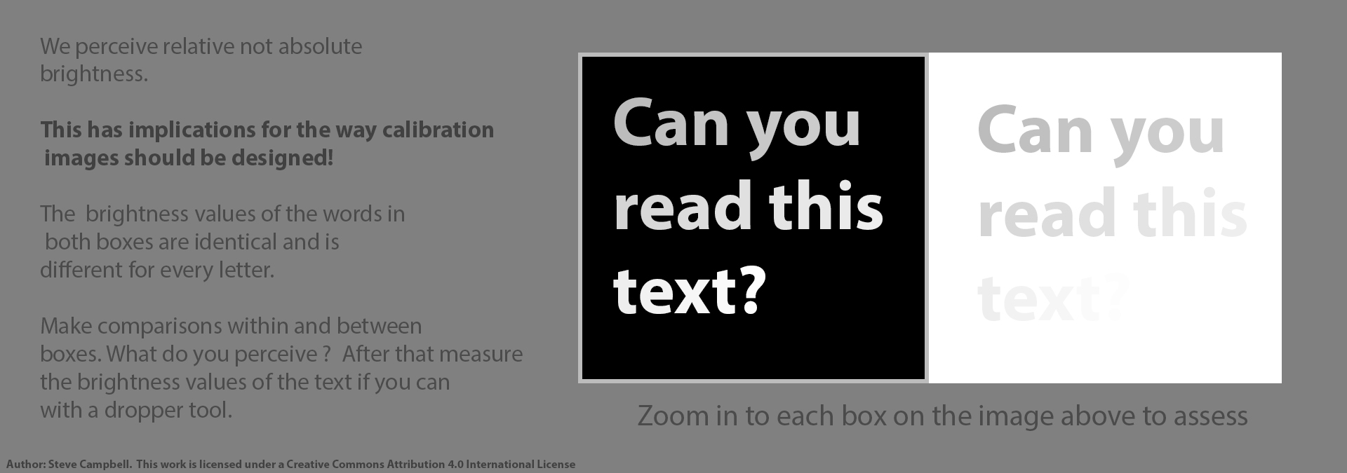
Hints, Tips and Recommendations:
Test Images
A Series of Test Images
After your screen is calibrated, you might also want to determine how well your system is performing by viewing a series of test images below. (In addition you might like to try the interactive monitor tests created by the monitor manufacturer EIZO).
Colour Test Image
The top left panel of the test image below was produced by Photodisc, now owned by Getty Images, and has a freeware licence. (PDI Freeware licence). The rest was produced by Steve.
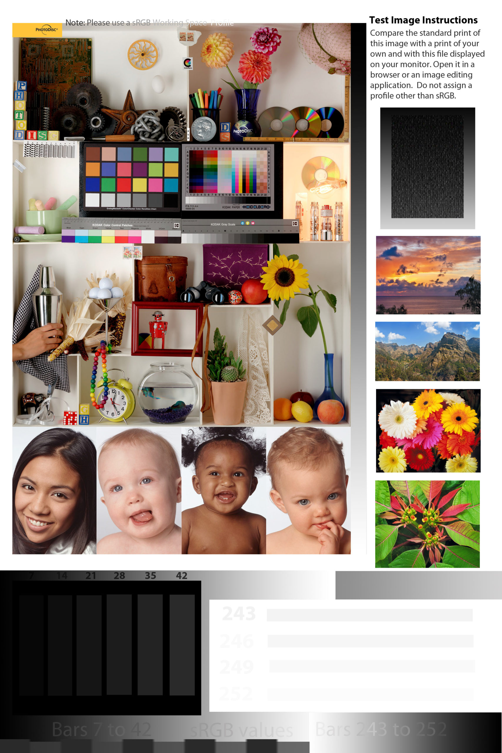
New members can borrow a properly printed version of the sRGB colour space image above from Steve that can be used to approximately verify screen calibration and printer performance.
When examining the image above be careful to look in a direction perpendicular to the screen, especially when using laptops or any desktop screen that has a very narrow optimum viewing angle. The print of the above should be illuminated by daylight.

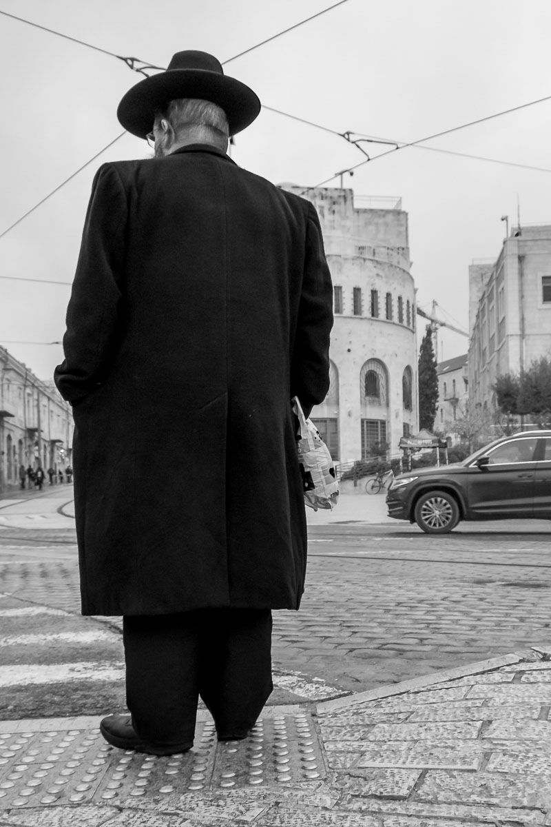
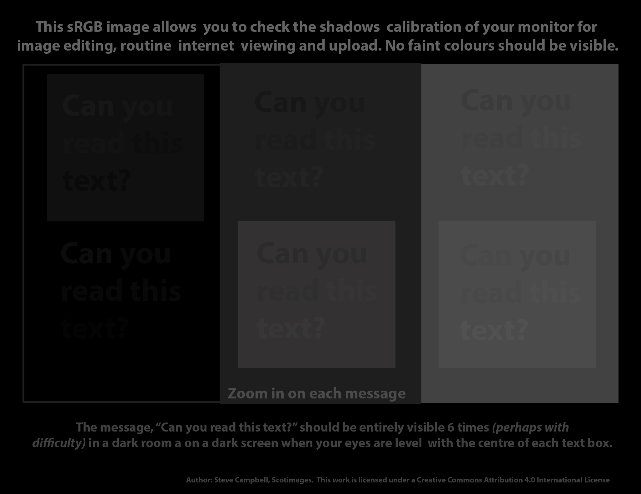
Mono Test Image for Very Dark Tones
Club member, John Hannah, has provided a very useful monochrome image that provides a very quick calibration test of the dark and very dark tones. There should be a clear difference in brightness between the man’s trousers and the bottom of his coat, for example. All of the central coat vent should be visible. Continuous texture should be perceptible over the entire coat except for pure black areas of shadow, such as that produced by his left and right arms. When the image is viewed at full size (or larger) against a darker background (in in a new browser tab, right click) you should be able to distinguish the black area of shadow just below his coat and continuous with his right inside leg from the rest of the trousers. You can check your perceptions against results shown the brightness dropper tool.
High Key Test Image
This greyscale table top image was produced by Steve to make clear how we can also encounter calibration problems at the upper end of the brightness scale
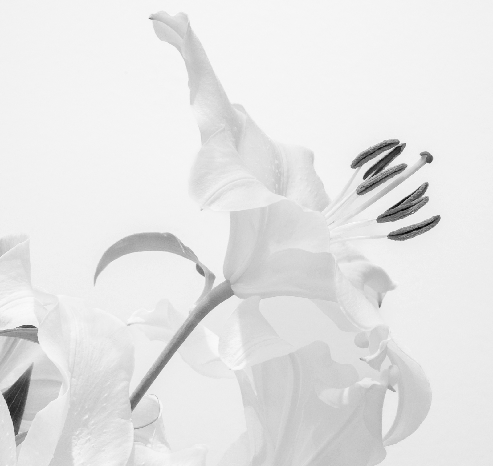
Competition judges sometimes make the false claim of seeing blown highlights when there are none. This is in part due to the limitations of human vision even when viewing 8 bit (or 256 grey level) images. The other possible reason is that their monitor is not properly calibrated for 8 bit sRGB output.
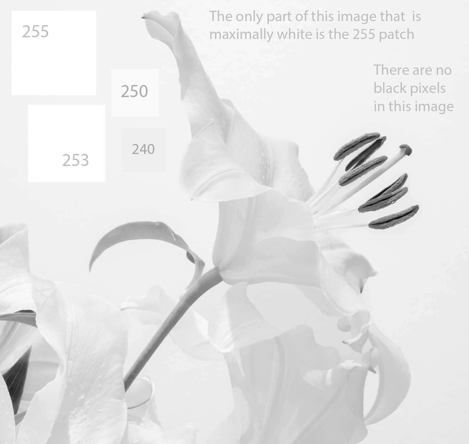
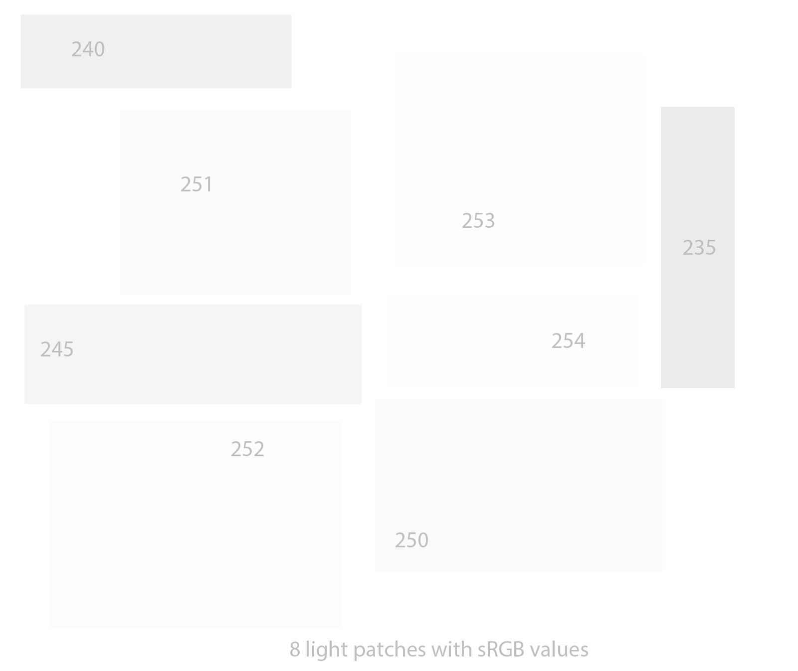
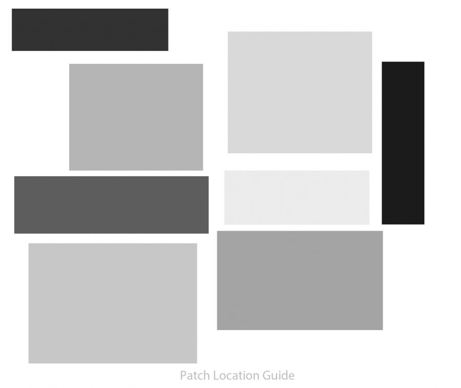
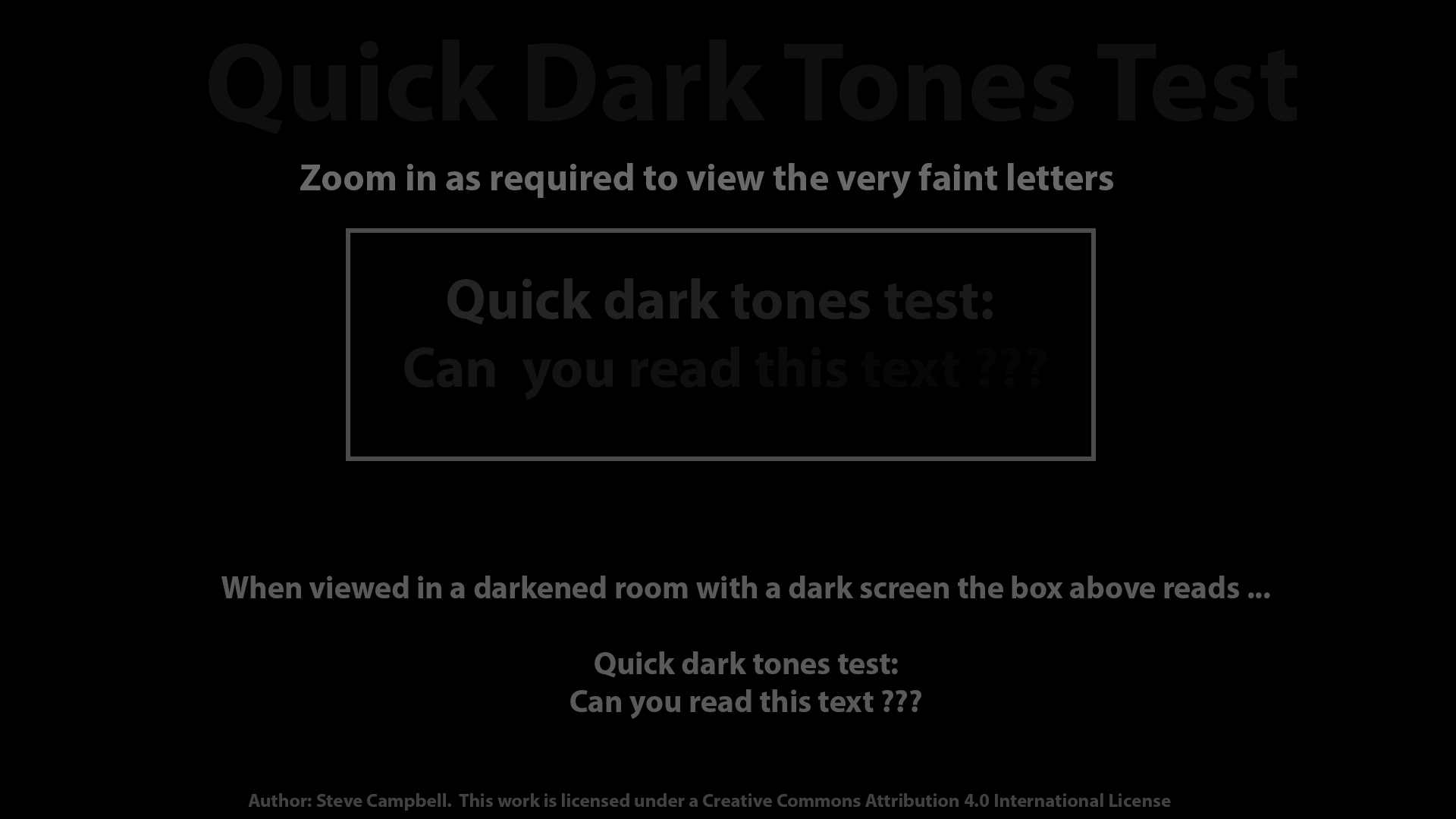
Steve’s Text-Based Test Images
Steve’s sRGB mode 8 bit greyscale test images below provide a rigorous test since proper viewing of them requires a good calibration (and a good screen). Some parts of the greyscale images shown below are only one grey level apart so if you can see all of the differences then you monitor is very well set up throughout the brightness range of 0 to 255. None of the greyscale images below should show any faint colouration if your screen is well calibrated.
In order to carry out proper testing, you will need to see much large versions of the images below. Click on each image to view them at a bigger size on your screen.


Tips and images by: Steve Campbell